Beginning Algebra
Tutorial 9: Reading Graphs
 Learning Objectives Learning Objectives
After completing this tutorial, you should be able to:
- Read a bar graph.
- Read a line graph.
- Read a double line graph.
- Draw and read a Venn diagram.
|
Introduction
In this tutorial we will be reading graphs.
Graphs can be used
to visually represent the relationship of data. It can help
organize
and show people statistics, which can be good for some and not so good
for others, depending on what the statistics show. Organizing
data
graphically can come in handy in fields like business, sports,
teaching,
politics, advertising, etc.. Let's start looking at some graphs. |
Tutorial
A bar graph can be used to give a visual representation
of the relationship
of data that has been collected.
It is made up of a vertical and a horizontal axis and
bars that can
run vertically or horizontally.
If the bars are vertical, match the top of the bar with
the vertical
axis found at the side of the overall graph to find the information the
bar associates with on the vertical axis. You will find what the
bar associates with on the horizontal axis at the base of the bar.
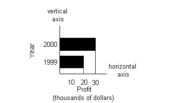
The bar graph below has vertical bars:
The horizontal axis represents years and the
vertical axis represents
profit in thousands of dollars.
The first bar on the left associates with the year
1999 AND the profit
of $20,000. The red line shows how the top of the bar lines up
with
20 on the vertical axis.
The second bar from the left associates with the
year 2000 and the profit
of $30,000. The blue line shows how the top of the bar lines up
with
30 on the vertical axis. |
If the bars are horizontal, match the right end of the
bar with the
horizontal axis found at the bottom of the overall graph to find the
information
the bar associates with on the horizontal axis. You will find
what
the the bar associates with on the vertical axis at the left end of the
bar.
The bar graph below has horizontal bars:
(Note that this graph shows the same information the
above graph does,
just with horizontal bars instead of vertical bars.)
The vertical axis represents years and the
horizontal axis represents
profit in thousands of dollars.
The first bar on the bottom associates with the
year 1999 AND the profit
of $20,000. The red line shows how the right end of the bar lines
up with 20 on the horizontal axis.
The second bar from the bottom associates with the
year 2000 and the
profit of $30,000. The blue line shows how the right end of the
bar
lines up with 30 on the horizontal axis. |
|
 Example
1: Example
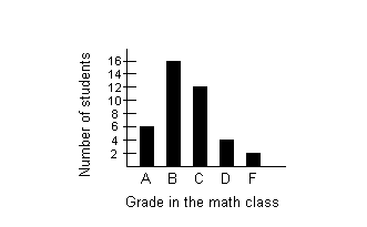
1: The bar graph below shows the number of students
in
a math class that received the grades shown. Use this graph to
answer
questions 1a - 1d. 1a. Find the number of students who received
an A.
1b. Find the number of students who received an F.
1c. Find the number of students who passed the
course (D or higher).
1d. Which grade did the most students receive?
|
The bar that associates with the grade A is the first
bar on the left.
The top of that bar matches with 6 on the vertical axis. 6 students received an A. |
The bar that associates with the grade F is the fifth
bar from the
left. The top of that bar matches with 2 on the vertical axis. 2 students received an F. |
We will have to do a little calculating here. We
will need to
find the number of students that received an A, B C, and D and then ad
them together.
The bar that associates with the grade A is the first
bar on the left.
The top of that bar matches with 6 on the vertical axis.
The bar that associates with the grade B is the second
bar from the
left. The top of that bar matches with 16 on the vertical
axis.
The bar that associates with the grade C is the third
bar from the left.
The top of that bar matches with 12 on the vertical axis.
The bar that associates with the grade D is the fourth
bar from the
left. The top of that bar matches with 4 on the vertical
axis.
6 + 16 + 12 + 4 = 38 students passed the course. |
It looks like more students received a B than
any other single
grade. |
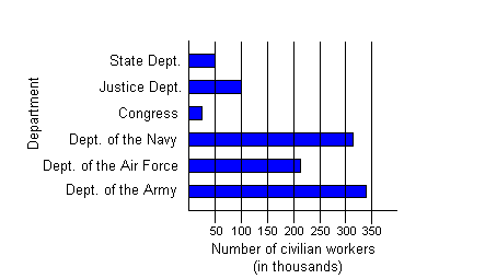
Example
2: The bar graph below shows the number of civilians
holding
various federal government jobs. Use the graph to answer
questions
2a - 2d.
2a. About how many civilians work for Congress?
2b. About how many civilians work for the State
Department?
2c. About how many civilians work for the armed
forces (Navy,
Air Force, and Army)?
2d. Which federal government job listed has the
most civilian
workers?
|
The bar that associates with Congress is the fourth bar
up. The
right of that bar lines up a little to the left of 50 on the horizontal
axis. Note how the question asks ABOUT how many. In some
cases,
if it does not directly line up with a number that is marked you may
need
to approximate. This is very close to and less than 50. A good
approximation
is 25. About 25,000 civilians work for Congress. |
The bar that associates with the State Department is
the sixth bar
up. The right of that bar lines up with 50 on the horizontal
axis.
About 50,000 civilians work for the State Department. |
2c. About how many civilians work for the
armed forces (Navy,
Air
Force, and Army)?
(return to bar graph) |
We will have to do a little calculating on this
one. We will
need to find the number of civilians that work for each branch of the
armed
services and then add them up.
The bar that associates with the Navy is the third bar
up. The
right of that bar ends between 300 and 350 on the horizontal axis. 310
is a good approximation for this number.
The bar that associates with the Air Force is the second
bar up.
The right of that bar ends between 200 and 250 on the horizontal axis. 210
is a good approximation for this number.
The bar that associates with the Army is the first bar
from the bottom.
The right of that bar ends just under 350 on the horizontal axis. 340
is a good approximation for this number.
About 310,000 + 210,000 + 340,000 = 860,000 civilians
work for the
State Department. |
It looks like the Army has the most civilian workers. |
A line graph is another way to give a visual
representation of the
relationship of data that has been collected.
It is made up of a vertical and horizontal axis and a
series of points
that are connected by a line.
Each point on the line matches up with a corresponding
vertical axis
and horizontal axis value on the graph.
In some cases, you are giving a value from the
horizontal axis and you
need to find its corresponding value from the vertical axis. You
find the point on the line that matches the given value from the
horizontal
axis and then match it up with its corresponding vertical axis value to
find the value you are looking for. You would do the same type of
process if you were given a vertical axis value and needed to find a
horizontal
axis value.
The graph below is a line graph:
(Note that this graph shows the same information the
above graphs under
vertical and horizontal graphs do, just with a line instead of bars.)
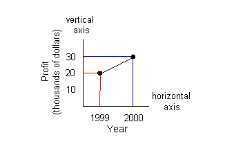
The horizontal axis represents years and the
vertical axis represents
profit in thousands of dollars.
The first point on the left associates with the
year 1999 AND the profit
of $20,000. The red line shows how it lines up with 20 on the
vertical
axis and 1999 on the horizontal axis.
The second point from the left associates with the
year 2000 and the
profit of $30,000. The blue line shows how it lines up with 30 on
the vertical axis and 2000 on the horizontal axis. |
� |
Example
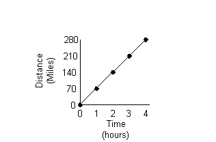
3: The line graph below shows the distance traveled
of
a vacationer going 70 mph down I-40 from 0 to 4 hours. Use
the graph to answer questions 3a - 3b.
3a. How far has the vacationer traveled at 3
hours?
3b. How long does it take the vacationer to travel
140 miles?
|
The point that matches with 3 on the horizontal axis
also matches with
210 on the vertical axis.
The vacationer has traveled 210 miles. |
The point that matches with 140 on the vertical axis
also matches with
2 on the horizontal axis.
It takes the vacationer 2 hours to travel 140
miles. |
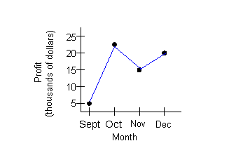
Example
4: The line graph below shows the profit a local
candy
company made over the months of September through December of last
year.
Use the graph to answer questions 4a - 4c.
4a. About how much was the profit in the month of
October?
4b. Which month had the lowest profit?
4c. What is the difference between the profits of
November and
December?
|
The point that matches with October on the horizontal
axis also matches
between 20 and 25 on the vertical axis. It looks to be about 23. The profit for the month of October is about $23,000. |
It looks like September had the lowest profit. |
The point that matches with November on the horizontal
axis also matches
with 15 on the vertical axis.
The point that matches with December on the horizontal
axis also matches
with 20 on the vertical axis.
The difference between the profits of November and
December would
be 20,000 - 15,000 = $5,000. |
A double line graph is another way to give a visual
representation
of the relationship of data that has been collected.
It is similar to the line graph mentioned
above. The difference is there are two lines of data instead of
one.
It is made up of a vertical and horizontal axis and two
series of points
each one connected by a line.
The legend will show which line represents what set of
points.
Most times a solid line and a dashed line are used. But varying
colors
can also distinguish the two lines apart.
Each point on each line matches up with a corresponding
vertical axis
and horizontal axis value on the graph.
In some cases, you are giving a value from the
horizontal axis and you
need to find its corresponding value from the vertical axis. You
find the point on the line that matches the given value from the
horizontal
axis and then match it up with its corresponding vertical axis value to
find the value you are looking for. You would do the same type of
process if you were given a vertical axis value and needed to find a
horizontal
axis value.
The graph below is a double line graph:
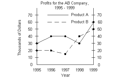
The horizontal axis represents the year and the
vertical axis represents
profit in thousands of dollars.
The legend towards the top of the graph indicates
which line represents
which product. The solid line corresponds with Product A and the
dashed line goes with Product B.
The first point on the solid line on the left
associates with the year
1995 AND the profit of $30,000.
The second point on the solid line from the left
associates with the
year 1996 AND the profit of $40,000.
The third point on the solid line from the left
associates with the
year 1997 AND the profit of $40,000.
The fourth point on the solid line from the left
associates with the
year 1998 AND the profit of $30,000.
The fifth point on the solid line from the left
associates with the
year 1999 AND the profit of $60,000.
The first point on the dashed line on the left
associates with the year
1995 AND the profit of $20,000.
The second point on the dashed line from the left
associates with the
year 1996 AND the profit of $20,000.
The third point on the dashed line from the left
associates with the
year 1997 AND the profit of $15,000.
The fourth point on the dashed line from the left
associates with the
year 1998 AND the profit of $40,000.
The fifth point on the dashed line from the left
associates with the
year 1999 AND the profit of $50,000. |
� |
Example
5: The double line graph below shows the total
enrollment
of students in a local college from 1990 - 1995, broken down into
part-time
and full-time students. Use the graph to answer questions 5a -
5c.
5a. What was the full-time enrollment in 1992?
5b. For what year shown on the graph did the
number of part-time
students exceed the previous year’s number of part-time students by the
greatest number?
5c. What was the total enrollment from 1993 to
1995?
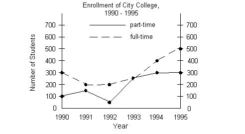
|
Since we are looking for full-time students, are we
going to look at
the solid or dashed line?
According to the legend, we need to look at the dashed
line.
The point that is on the dashed line and matches
with 1992 on
the horizontal line also matches with 200 on the vertical line.
There were 200 full-time students enrolled in 1992. |
5b. For what year shown on the graph did the
number of part-time
students exceed the previous year’s number of part-time students by the
greatest number?
(return to double line
graph) |
Since we are looking for part-time students, are we
going to look at
the solid or dashed line?
According to the legend, we need to look at the solid
line.
When looking at the graph, we are only interested in a
rise in the number
of part-time students. From 1990 to 1991, the number of part-time
students went up 100 to 150. From 1991 to 1992, it went down from
150 to 50. From 1992 to 1993, there was increase from 50 to
250.
From 1993 to 1994, there was another increase, this time from 250 to
300.
The last years, 1994 - 1995, it held steady at 300.
So, what year exceeded the previous number of part-time
students by
the greatest number?
Looks like 1993. There were 200 more part-time
students in
1993 than there were in 1992. |
Let’s break this down into part-time and full-time
students.
Looking at the dashed line to see the number of
full-time students we
get 250 + 400 + 500 = 1150.
Looking at the solid line to see the number of part-time
students we
get 250 + 300 + 300 = 850.
Putting those together, we have 1150 + 850 = 2000
students who were
enrolled from 1993 to 1995. |
Venn diagrams are a visual way of organizing
information. It
can be very helpful when you have a problem to solve that categorizes
or
shows relationships between things.
A common use for Venn diagrams is analyzing the results
of a survey.
For example, you may have a survey of students asking them which
classes
they like and perhaps you listed math and english. The student
could
check 0, 1, or 2 of these choices. You would strategically place
the results in a Venn diagram. If they only choose math, then
they
would go in a particular region of the diagram that shows that,
if
they picked both, they would go into the area of the diagram that
depicts
that, etc. Of course there are other uses for the Venn diagram,
that
is one of the more common ones.
The graph below is a Venn diagram:
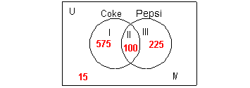
This diagram represents the results of a survey of
people who were asked
if they liked Coke or Pepsi. They could choose only Coke, only
Pepsi,
both, or neither.
Note that a lot of times you do
not see the
letter U or the roman numerals on a Venn Diagram (just the box and the
circles), I use them as references so you know what area of the diagram
I'm talking about in the lesson.
The rectangle box represents the universal set
U. The
universal set is the set of all elements considered in a problem.
In this example, the universal set are all the people who took the
survey.
The circles represent the categories or subsets
involving the universal
set. In this example, the two categories or choices on the
survey
were Coke and Pepsi.
When you draw a Venn diagram, you want to overlap the
circles in case
there are some that pick both categories. We need to make sure we
accurately place those people and do not count them more than one time.
The roman numerals are called region numbers.
Region I represents everyone who selected ONLY Coke
which was 575 people.
Region II is where the two circles intersect or
overlap. It represents
everyone who selected BOTH Coke and Pepsi which was 100 people.
Region III represents everyone who selected ONLY Pepsi
which was 225
people.
Region IV is inside the rectangle, but outside the
circles. It
represents everyone who selected NEITHER Coke nor Pepsi which was 15
people. |
Example
6: A teacher took a survey on pets in her class of 40
students. 12 students said they had a cat. 9 students said
they had a dog. 2 said they had both a cat and a dog. How
many
students picked neither? How many students had only a cat?
How many students had only a dog? |
The first thing we need to do is draw a Venn diagram
with two adjoining
circles - one for cats and one for dogs.
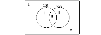
Now we need to fill in numbers into the correct regions
based on the
information that was given.
We need to start with something
that only goes
with one region and then work our way out from that.
The only statement that deals with one region is 2
said they had
both a cat and a dog. That would correlate with region II.
So in region II, we would put a 2 as shown below:
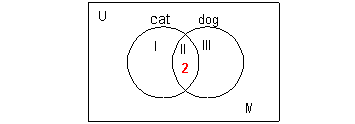
Next let's look at the statement 12 students said
they had a cat.
Be careful here. It is very tempting to put a 12 in region I -
but region I is reserved for those students who ONLY have a
cat, which
is different. When it says they had a cat, it means they checked
it off on the survey and may or may not have checked off dog
also.
The cat circle includes regions I and II. Since we already
have region II filled in with a 2, we can use that with the fact that I
and II have to add up to be 12 to figure out what goes in region I -
what
do you think??? If we take 12 - 2 we get 10 left that have no
other place to go but region I.
This puts everybody in the
correct spot AND
does not count students more than 1 time.
We can use the same type of argument when working with
the statement
"9 students said they had a dog." Again, it did not say ONLY dog
- so 9 will have to fit into regions II and III and since
we already
have II filled in with 2 students that will leave 9 - 2 = 7 to go into
region III.

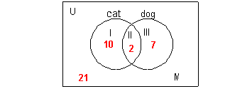
That leaves us with having to fill in region IV. We can
use the fact
that 40 students answered the survey and that we have three of the four
regions filled in. So we can take the total of 40 and subtract
everyone
that is already accounted for and that will leave us who is in region
IV: 40 - 10 - 2 - 7 = 21.
Overall, you need to start with the information that
goes with only
one region first. If you start with something that goes with more
than one part, then you will not know how to split it up
appropriately
so everyone is in the right spot AND is not counted more than one time.
For example, if we would have started with the fact that there were 40
students, we would have had trouble because all four regions would make
up all the students surveyed. We wouldn't know how to
appropriately
split that 40 up. Or if we looked at the fact that 12 choose a
cat
to start with, we would not know how to split it between the two
regions
that make up the cat circle.
Final answer:
Looking at the Venn diagram, the students that chose neither would
be in region IV, which comes out to be 21. The students who chose only
a cat would be in region I, which is 10. The students who chose
only
a dog would be in region III, which is 7. |
Practice Problems
�
These are practice problems to help bring you to the
next level.
It will allow you to check and see if you have an understanding of
these
types of problems. Math works just like
anything
else, if you want to get good at it, then you need to practice
it.
Even the best athletes and musicians had help along the way and lots of
practice, practice, practice, to get good at their sport or instrument.
In fact there is no such thing as too much practice. To get the most out of these, you should work the
problem out on
your own and then check your answer by clicking on the link for the
answer/discussion
for that problem. At the link you will find the answer
as well as any steps that went into finding that answer. |
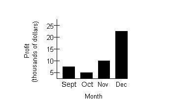
 Practice
Problems 1a - 1c: The bar graph below shows the profit
a cd store made
over the months of September through December of last year.
Use the graph to answer questions 1a - 1c. Practice
Problems 1a - 1c: The bar graph below shows the profit
a cd store made
over the months of September through December of last year.
Use the graph to answer questions 1a - 1c.
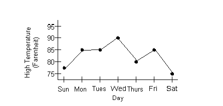
Practice
Problems 2a - 2c: The line graph below shows last
week's high temperatures
in Fahrenheit. Use the graph to answer questions 2a - 2c.
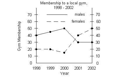
Practice
Problems 3a - 3c: The double line graph below shows the
total enrollment
of people who work out at a local gym from 1998 - 2002, broken down
into
males and females. Use the graph to answer questions 3a - 3c.
Practice
Problems 4a - 4c: A group of students were asked if
they liked rock or
country music. The results were as follows: 27 said they liked
rock,
20 said they liked country, 5 liked both, and 3 liked neither.
Need Extra Help on these Topics?

Last revised on July 25, 2011 by Kim Seward.
All contents copyright (C) 2001 - 2010, WTAMU and Kim Seward. All rights reserved.
|
|